Flourish
floral bouquet preview app
Flourish
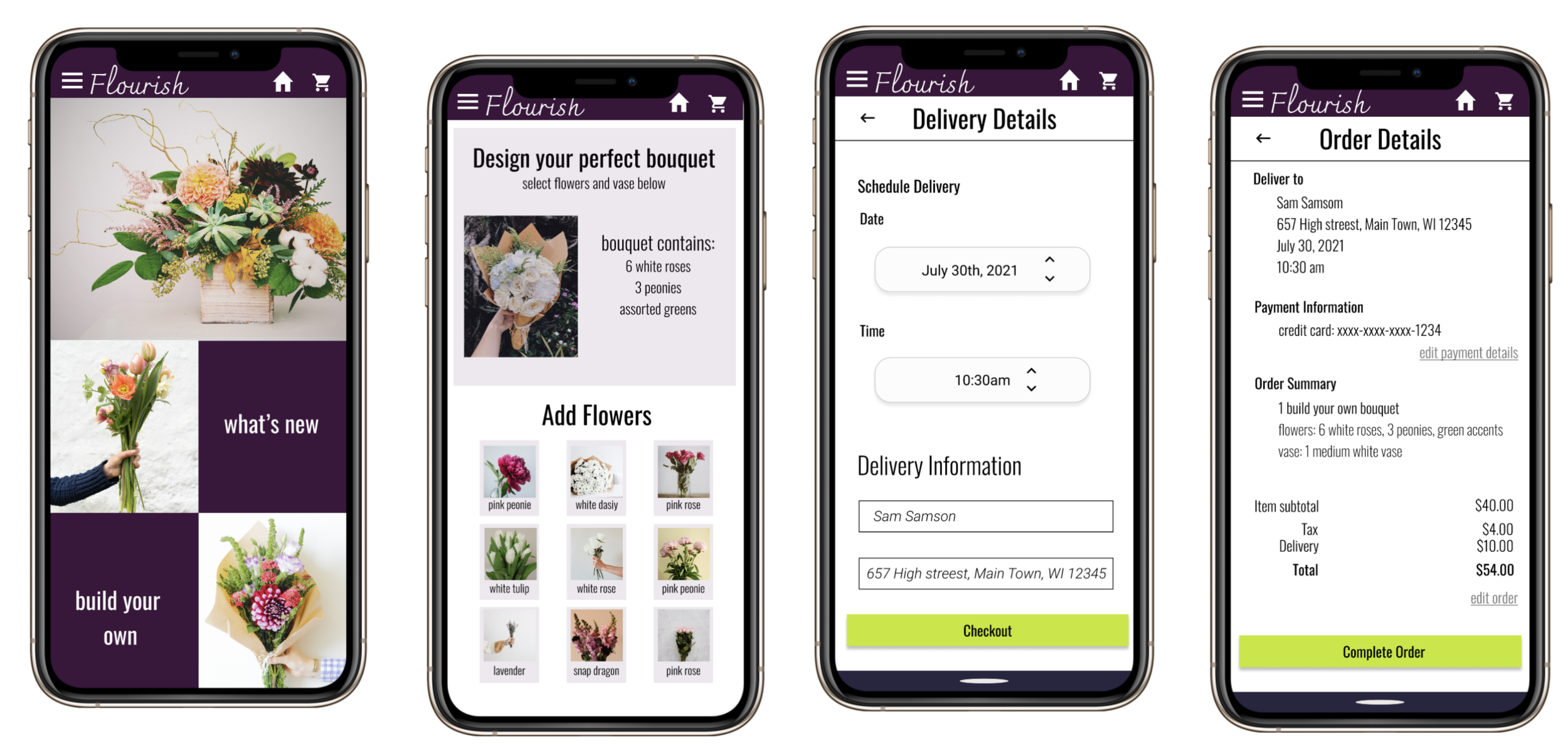
Flourish is an app where people can design, preview and order floral bouquets. Flourish wants to give people the opportunity to create their own bouquet while also offering suggestions and premade arrangements for users who want more guidance and quicker options. Flourish is for customers who want ease of use, a good value, and a chance for creativity.
my role
ux designer
tools
figma, miro
duration
2 weeks
The Challenge
Users feel uncertain about the product they are buying, specifically a lack of confidence that the bouquet will look like images online shop.
Design an app that allows users to feel more confident about their purchase.
The Outcome
Flourish offers a clear and clean layout where users can create and purchase floral bouquets.
Competitive Audit
Understanding User Needs
Research
I conducted interviews and created empathy maps to understand the users I’m designing for and their needs.
A primary user group identified through research was people aged 30 - 65 who are buying flowers as a gift for loved ones. This user group confirmed initial assumptions that users want to purchase a bouquet that their loved one will appreciate.
Research also revealed that users want to feel as though they are getting a good value and buy something that reflects their loved one’s style.
Pain Points
Style
Floral sales platforms do not allow for the user to customize their bouquets.
Cost
Users want to know what they are getting so they can assess if it’s a good value.
Expectations
Most platforms do not give users a clear preview picture of what they will be receiving.
Wireframes
Creating paper wireframes helped me iterate how to display images of floral bouquets on the homepage without overcrowding the page.
In the initial design phase I focused on creating easy navigation and quick access to floral options and suggestions from the homepage.
Easy access to the cart while also being able to view what the user has added to their “build your own bouquet” were priorities in the wireframe designs.
Digital Wireframes
In the initial design phase I focused on creating easy navigation and quick access to floral options and suggestions from the homepage.
this iteration included a cart icon for quick access and a list of the “build your own bouquet” contents
The drop down menu provides quick access to different flower options as well as the user’s profile and history.
Users can quickly access bouquets organized by color, occasion and what new.
Low Fidelity Prototype
The set of digital wireframes was used to create a low-fidelity prototype with the main user flow focused on creating, purchasing and setting up a “build your own bouquet”.
Usability study: findings
I conducted two rounds of usability studies. Findings from the first study helped guide the designs from wireframes to mockups. The second study used a high-fidelity prototype and revealed what aspects of the mockups needed refining.
Round 1
Users want clear buttons and pathways
Users want suggestions
Users want easy cart access
Round 2
Users would like the ability to move back and forth easily through platform.
Users would like a more clear checkout procedure.
Mockups
Users thought the preview was too large and didn’t allow them to see items lower on the screen without scrolling. I condensed the preview and changed the view of vases to a carousel.
Further Iterations
Usability studies indicated that the original design for the checkout should be more clean and clear. I changed the checkout process to span over three screens and more clearly defined the hierarchy.

Final Design
The high fidelity prototype offered clearer options to add items to the bouquet as well as a more organized checkout system.
Retrospective and Next Steps
The app makes users feel confident that they know what their bouquet will look like on arrival and that they are getting a good value.
The importance of a wide array of test users, as they can offer many insights.
Conduct further usability studies regarding selecting flowers by color, style, occasion and popularity.
Conduct further user research to identify any other areas that need development.


